Every product looked different.
Inconsistent UI, mismatched components, and no shared design system. Designers kept recreating elements, developers implemented styles differently, and accessibility was an afterthought. This led to slower design, longer development cycles, and constant UI inconsistencies.
- No design system — just a basic UI kit, components without rules, tokens, or patterns.
- Every designer solving the same problems differently — tables, filters, empty states, and error states, all inconsistent across modules.
- The product looked stitched together — visual language and interaction patterns shifted as you moved between modules.
Slower design, longer development cycles, and constant UI inconsistencies — the cost of no shared system, paid every sprint.
Not just design — a system built to scale.
RetroGlitch wasn't a component library dropped next to the product. It was infrastructure: reusable components, a token architecture, an engineering integration, and the guidelines to keep it all coherent as the team grew.
Reusable components
Defined a shared library of buttons, forms, modals, and layouts to eliminate redundancy.
Design tokens
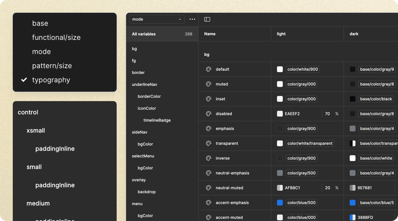
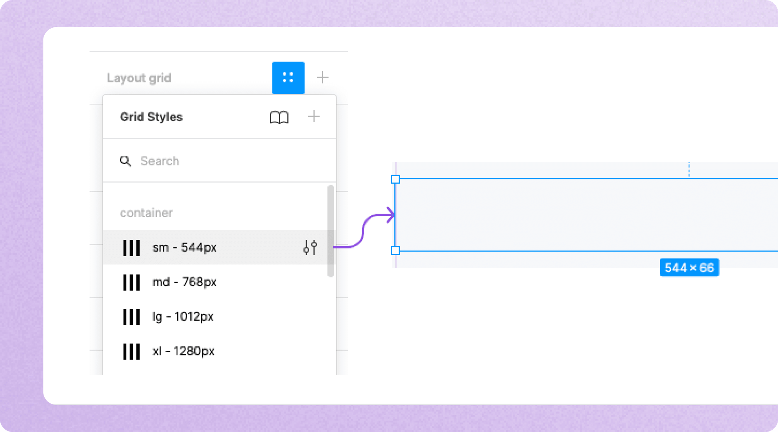
A structured system for colors, typography, spacing, and shadows — making theming effortless.
Storybook integration
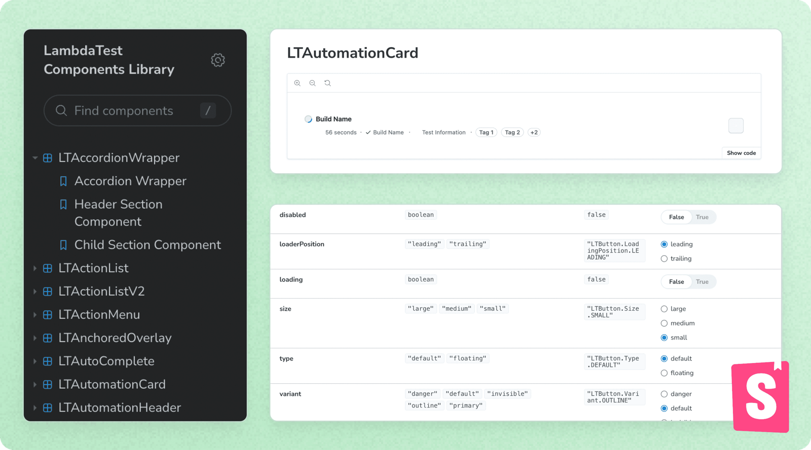
Worked with engineers to implement Storybook, making components easily accessible for developers.
Guidelines & best practices
Detailed usage guidelines, dos and don'ts, so the system stayed coherent without me in every review.
Responsiveness principles
A seamless UI across all screen sizes and resolutions — designs that adapt to any device by default.
Iconography system
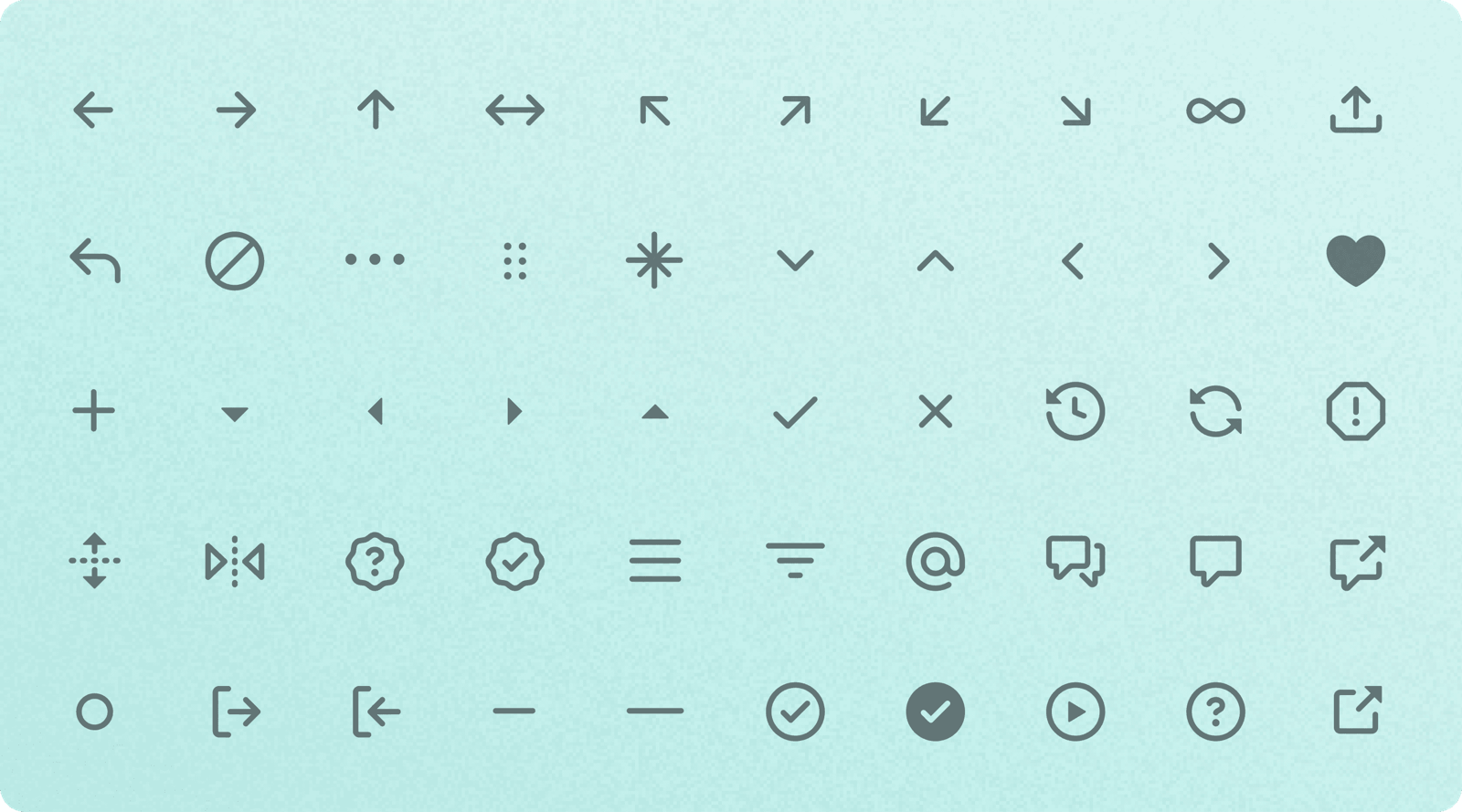
A consistent icon library to maintain visual harmony across every product surface.
What the system actually looks like.
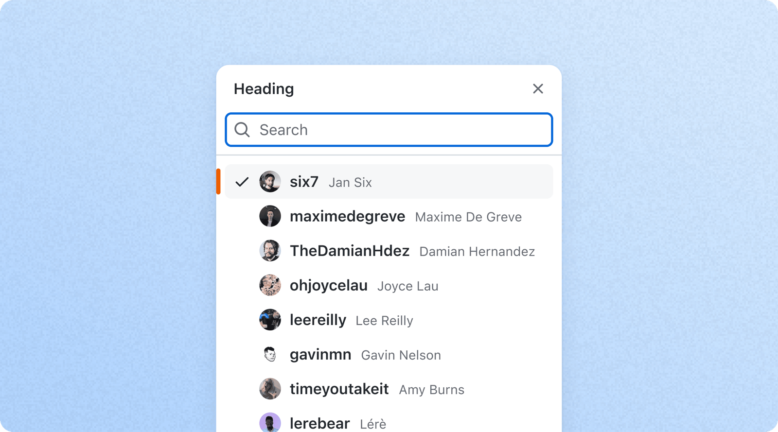
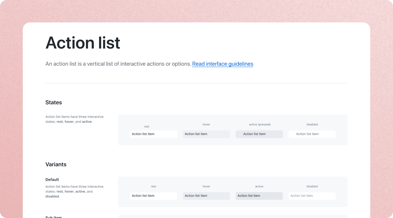
A look at the working parts — the search pattern, the token architecture behind theming, the Storybook docs engineers build from, and the component and icon libraries designers compose with.
What once took hours now takes minutes.
RetroGlitch redefined how products were designed, built, and scaled — eliminating inconsistencies, streamlining workflows, and making accessibility a standard. With a shared component library, design tokens, and Storybook integration, teams worked faster and more efficiently. Light and dark mode became effortless, and WCAG compliance was built in from the start.
- Faster design and development — standardized components and tokens reduced UI inconsistencies and sped up iteration.
- Empowered cross-functional teams — PMs and other stakeholders could create and refine designs without relying entirely on designers.
- Scalable and future-proof — new features and products maintained a cohesive experience with minimal effort.
RetroGlitch wasn't just a design system — it became the foundation for how we built and scaled products.